Monday 4 May 2015

Blog Thirty Five - overall evaluation

When I first started doing this project I didn't really know how it was going to go. I was very open I minded and open to trying new ideas. I didn't really know what I wanted to do until I had a good long think. I found learning the tools and techniques needed was quite easy and seemed to pick them up quite fast. 

Once I had decided the topic I wanted to do I found it quite easy to do. 
I think that I could have possibly chosen a topic a bit earlier than I did as it would have then given me more time to then create all of the needed things. 
Once I had come up with an idea I found it quite easy to choose the key people that I wanted to include in it. As there have been a large number of outstanding footballers at Arsenal a few stood out to me straight away!! 

Choosing things to put on the case was where the issues came as most if not all DVD cases come with different images on the front and back cover where as I decided to use the same image to keep the theme fitting, as if I had changed the back, I think I would struggle to get the colour match that I would've wanted as I had the pitch and the green as the image.

I decided that I wanted to use the emblem and also include one of my faveourite players on the emblem. I did have fun playing around with different effects to get a really unique and different effect on his face. This for me went really well as I was looking for something different, that would stand out and I believe that I achieved this!! 

If I was to do this again I think I would make a few changes even though I am very happy with the outcome of my project. I think I would choose a different genre as I found that this was a very open genre where it was quite easy to get hold of images & clips. Other people did different genres for example sci-fi. I believe doing something like this would stretch me as I don't really know much about this kinds of films.

I feel that all of the areas of the project worked well together and I had no issues ensuring that they all fitted the theme correctly and were consistent throughout. 

I feel that through-out the project it all went quite well and I didn't have any major issues. Only minor which are in previous blogs. I was able to do everything that I wanted to do and no issues. I feel that I have very much expanded my knowledge base and that I would be confident doing this again!! 

After feedback from other people I feel that this module is a very fun and exciting module and would gladly do it again. However making some changes for example the Genre to stretch myself a bit more on show that I really do know what I'm talking about when it comes to making films on DVD cases.

Blog Thirty four - extra effects

When I was watching my trailer back I had decided that I liked everything in it including the effects, transitions and text. I have decided that I was going to possibly add one more effect, this effect was at zoom & pan effect. This effect was going to be placed on one of the still images that I had added into my video this was the Arsenal image taken by myself at the Emirates Stadium.

Doing this affect wouldn't of taken me a very long as I feel I'm quite confident using premiere pro and all its features, however I wasn't able to do this because I didn't have enough time and I had software issues.

To do this in fact it's quite simple you needed to go into the effects Control Panel and add a timer on to the selected image at the start of it, once you are done this you could play around with the zoom and the pan to make it how you wanted it. Once you have done this you should then put another timer at the end of the image or where you would like the zoom & pan to end. This effect is used quite widely in films as it gives a really nice effect.


Blog Thirty three - case size

When it came to doing the case size for the blog we were given a rough outline of what size it should be, so I set my page up to be the outline we were given we also googled a few different images to see an average size of the DVD casing.

I designed my DVD casing on the templated blog that we were given as I thought the dimension sounded just about right. Before I finalise my design I wanted to make sure that it would fit in the case once the bleeding edge et cetera had been chopped off. So when I had a rough idea of what I wanted on that just the spine and the front cover to start off with I printed it to make sure that it fitted and none of the stuff I was putting on there would have to be taken off or cut off. When I had printed the first copy I printed it on an a four sheet of paper in black-and-white just to ensure that I wasn't going out any think in areas where it needed to be chopped.
By doing this I was then able to change the DVD case alright to ensure that it was the correct size as I had done it too big and it was then able to carry on with my design ensuring that everything stayed within the specified size. Below you will see an image of this with my calculations on it.


As you can see I needed to chop quite a lot of Lexus paper off therefore I needed to drastically reduce the size of my DVD casing.I had made sure that I haven't gone very far into my design before I needed to change this as if I got a bit further in I would've been quite annoyed as you can see I had laid out where I wanted everything to go. I have since then made a few changes to my DVD casing ensuring that every think I have added fit inside the specific size range.

Sunday 3 May 2015

Blog thirty two - Green Screen effects

When using a green screen you're able to add a large number of effects. For example you can change the background to put you in any setting, you can change the person you can change the colour of their clothing and you can change what they look like can make them larger or smaller and you can also make things possible that aren't usually possible.

A lot of people and places use green screens. For example; weather reporters will use them for the maps that they are showing on the television. The weather reporter will not be able to see the map behind them they will need to learn were things are to be able to correctly show the viewers where things are. 

I large number effects that are in some of your favourite films are done on the green screen. A lot more is Donna green screen that you actually believe would be done. 

A lot of outdoor effects are done using a green screen even if it's only to make the scene look brighter. Or rain when it's sunny. 
When using a green screen it's important to remember that if you are wearing green clothing that part of you will not be seen due to the backdrop of the screen. If it is your legs that are in green then it will appear that you are floating as the green screen will match and blend in with your clothing. This is one reason as too why television presenters will not wear green clothing. 

Saturday 2 May 2015

Blog thirty one - File Types Continued. (Casing & Disc.)

In a previous blog I have written and told you what file types I have saved my Casing and Disc in. In this blog I just explain a little bit more about this.


When saving my DVD casing and DVD label I knew that I couldn't save them in the original file formats as they wouldn't be able to be opened anywhere you would need the specific software to be able to open them and view them. It also matters when it comes to things like blowing the image up or making them smaller as you could loose the focus from the image then making it become distorted.


When I was looking at file types and how to save the files I kept in mind that I need to be up to open them and view them in any software.
I Changed the file type that I saved it in by exporting to web which would mean that is suitable for viewing on the Internet as well as other software for example picture viewer in Microsoft. This would then be viewable wherever you wanted it to be.
If I had kept the file types the same as they were I would have had issues down the line for example when my work is being marked. If the marker does not have the required software then they would not be able to fully view my work and therefore will not be able to see all of the effort and time I have put into it.
When I have done work I like to show it to other people that don't always know what I'm doing as it helps me to get feedback and input from out-side people. But to do this I need to make sure that I have them saved in a relevant file type. For example a GIF or a Jpg.

Blog Thirty - Changes made to casing

I'd originally made my DVD casing with not a lot of information on the back, however I then decided that I wanted to add more information for example the language the film is in. I decided to add this in a box that you could find on a real DVD case.
I did this as I think it makes it look a bit more professional and it also gives you a little bit more information about the film. For Example if you were buying it from another country or spoke different language you know that you wouldn't be able to watch it and fully understand it as it wouldn't be in your language.


By making this change I thought I just added a little bit more to the box filled in a bit of blank space and also made it look more attractive. By doing this I had to move other items around to ensure that everything could fit how I wanted it to. I've made these changes and then printed off ready to put in my DVD casing.


Once I had printed it I'd realised that everything was too close to the edge so therefore when I chopped the bleeding edge off I chopped some of the text off that I do really hard on the case. I quickly rectified this by moving things around and moving them down and more central to DVD the spine to ensure that if I do need to chop anything else off it will still all fit perfectly and look just how I want it to.
I have since reprinted my DVD casing and it all seems to fit perfectly and look just how I want it too.

Blog Twenty Nine - Further changes made to trailer

After I had received the feedback I then went and acted upon it as I thought that the changes that were given to me were relevant and would make a difference to the final product of my trailer.
I don't usually take criticism very well however I took all of this criticism on board and also made some more changes.


I also felt that the type of text I had used wasn't appropriate for their subject I have chosen as it looked a bit like a text font you'd find in Disney film. Making the changes that I made were quite easy.


I made changes to the end of the film to ensure that all of the text was spoken. I also made sure that the music fitted properly and ended well. I did this because the music I had chosen played on a continual loop and I needed to make sure that it sounded right in dentist and halfway through that continual loop.

I changed the text font that had used and also the colour of the text to make it fit in and blend in more as I didn't really want it to stand out that much as I already have the logo standing out quite a lot. When it comes to choosing things like the text that will accompany your film/trailer I think that it is important to get it right as if you choose the wrong text in your trailer it may give off a wrong impression about your trailer/film to the viewer.
For example I used quite a childish font in my trailer which I believe gave the sort of impression that the film would be suitable for children as it was a very young looking and inviting text font. Now that I have changed it I believe that it fits the theme and also looks a lot better than it did before.

Blog Twenty Eight - Feedback

Once I had done the first version of my trailer I then decided it would be a good idea to ask people what they thought of it and if there were any changes that I could possibly make to make my video even better than it already was. I found it hard to pick fault with the work I had already done as I couldn't see anything wrong with it.
However I did receive a bit of feedback which I have worked on to improve my video. The feedback I received is as follows;


      • Change the music to something more upbeat
      • Change the ending as it ends to fast


The music that I originally had was a bit down beat and didn't really fit the theme that I had chosen to go with. The music was quite serious that was one of the main reasons in which I had chosen it as I take football quite seriously and thought the music was quite fitting. However the music didn't appeal to anybody else's taste therefore I decided to change the music and look for something a little bit more upbeat. I finally decided on the match of the day theme tune. I thought this was very fitting as it was a football theme that a lot of people know and can relate too.

I also was told that when my video ended it ended way to fast it was as if the words were cut off at an abrupt end. It ended saying "They think it's all over it is" and then ended I hadn't allowed enough time for the full clip to be played. I had a look at things to see if there was anything in which I could move and edit. I was able to make some small adjustments with the sound and make the clip end properly and with no words being cut off. This was quite an easy and simple problem to fix.

Blog Twenty Seven - downloading Audio and Video

When I was told that we were to download our audio and video clips I started to freak out a little bit as I didn't really know how to due to copyright etc. However we were told that we were to download them from YouTube.

When you download from YouTube using Mozilla Firefox you are easily able to install a downloader which then enables you to download any videos you wish to. Luckily for me I was able to also get the audio that I wanted from YouTube therefore making the whole downloading process a lot easier.

When choosing the download option there is generally a few different options these are the save options. I will always choose the MP3 option as this is the better file type to choose you can open and use this just about anywhere. I will always go for the higher option as this will mean that the resolution will be the best it can be.

Once the files have been downloaded you are then able to open them and edit them in any way you wish. This is a quick and easy way in which you can download almost any video and audio clips and use them for what ever purpose you wish to.

Blog Twenty six - further issues (printing)

When I had decided that I wanted to print the things I had created as I had put a lot of effort into creating them and making them look how I wanted to. I did however have issues when it came to printing them.

DVD Casing
When I was printing the DVD casing I had to print it a few times. The first time I had printed I then decided that I wanted too add to it therefore I had to get it printed again. I took it to staples to get printed as I thought that I could get it done on the glossy paper that DVD casing gets printed on as I think that it looks nicer. The second time I went to get it printed the printer was unable to print it the first four times that it was attempted. However once the printer had been sorted out it was then able to print with ease.

When I then tried to put it inside the casing it didn't fit as I had moved things around too much this therefore means that I need to again change my DVD casing and re-print it.
DVD Label

My DVD label printing went a lot smoother however there were still issues. When I went to get it printed I just assumed that it would print how I needed it to as I had set up the size before I created it. However this was not the case when I was printing it I needed to ensure that I had chosen the correct way as when I first printed it covered one A4 sheet of paper which was no good as I only wanted it to fit on the DVD disc. Once the paper was set up correctly it printed perfectly.

Blog twenty five - File types for premiere pro

When saving the trailer I had created I knew that I needed to save it in an appropriate format in which I would be able to open it anywhere so that anybody could view it at any time and possibly make changes if any were needed.
There were a few options in which you could save it as I Googled a few of them and then decided on AVI as when you save in this format you are able to save and view back audio and video which is handy as they are the things in which I want to be able to view.

As I had created a trailer with audio and visual I thought that this one would be the most fitting as there shouldn't be any issues when it comes to playback. It is used for watching videos which are of a standard format. It is used by DivX video. It is certified to be used on anything from a television to a tablet.
It is a basic file type however it covers all of the basis that I need to cover therefore I have no issue in using it as it means that no matter what machine you run be it Windows, Linux, Mac etc. you will be able to view my Video just as well as anybody else, as there will be the standard viewing platform that your machine uses.

Blog twenty four - Copy right laws

In a previous blog I have spoken about the legal and ethical side of photo manipulation. In this blog I am going to talk about the copy right side of photo manipulation and just generally taking other peoples photos and using them for your own purposes.
If you look at the copy right laws you will see that there are a lot of things which are covered by this law. These are;
Literary
song lyrics, manuscripts, manuals, computer programs, commercial documents, leaflets, newsletters & articles etc.


Dramatic
plays, dance, etc.


Musical
recordings and score.


Artistic
photography, painting, sculptures, architecture, technical drawings/diagrams, maps, logos.
Typographical arrangement of published editions
magazines, periodicals, etc.


Sound recording
may be recordings of other copyright works, e.g. musical and literary.


Film
video footage, films, broadcasts and cable programmes.
As you can see the fourth one down says Artistic which will cover anything from photos to maps.


Films and also sound recordings are covered also. So this covers everything that I am using to complete my work.
If you are going to create something for example a song then you need everything to be completely original to say that it is yours if you do not then the rights of that particular bit of work will stay with the original author.
It is important that you keep to the laws as if you do not then you could and most likely will end up in a large amount of trouble.

Blog twenty three - file formats for photoshop and illustrator

When creating my files they were saved in PSD format when it was a Photoshop file and an adobe illustrator file when I did it in illustrator. These file types are okay however if you do not have the chosen program installed on your computer then you will not be able to open the image. When you are saving this you have the option to save the file for web which will enable you to be able to open the file elsewhere, you will not be able to make changes however but you will be able to do things like print the image. For me this was an issue as I wanted to get it printed on glossy paper to make it look as good as I could, however I did not have the required software at home to be able to print them off.


By changing the file types for the DVD casing and the DVD label you are ensuring that anybody is able to open the file and view it no matter what software they have on their machine. I decided to save my casing as a Jpg file as I had issues trying to save it in any other format as the file size was too large and lost the quality of the over all image. In some file types it wouldn't even allow the file to fully open therefore you were not able to view the full image.
I saved the DVD disc as a GIF as I had the same issues with this.
I also believe that they are both well know file types and you are able to access them using any machine with-out having special software installed on your machine making it easier for everybody.

Blog twenty two - over coming more problems

There was a few more issues that I came across whilst I was doing my trailer I did manage to overcome all of them however. The issues I came across where;
Size limit 1:00 min
Marking in and out at the right times
Choosing the right age rating


The size limit for the trailer we were doing was only 1 minute therefore it meant that we had to make all of our selected footage fit into a 1 minute time frame. I found this quite hard as I had a large number of clips that I wanted to use. By cutting sections out of the clips and audio I was able to stick to the allotted time frame. I found it quite hard to get it exactly 1 minute however I moved some aspects around and managed to get it to fit perfectly.


When I had chosen which clips I wanted to use and which sections of the clips I wanted I had some issues when it came to marking in and out whenever I decided to mark in I had problems getting it exact as if you didn't get it 100% spot on then there would be issues that arose later on when putting all of my clips together as they wouldn't make sense as the issues were with the audio rather than the video. It took me a long time get it perfect however in the end I managed to get them all where I needed them to be.


When I was choosing the age rating I found this quite hard as I wasn't really too sure what to put it as. I looked at other videos that were already out there. I decided on a 15 as I thought that there may be possible bad language through-out the film as it was based on football and footballer tend to have bad language when they are being told off by the referee.
These problems were quite easy to overcome.

Blog twenty one - Extra added effects


Whilst I was adding effects to my trailer I had thought about the titles and credits in which I am going to have at the beginning and end of the trailer. I knew the sort of thing in which I wanted it was just a case of finding it.


There are a few different ways in which you can have your title to make it look different and stand out from normal plain text. I decided to have my credits set as a roll/crawl crawling to the left as these are the effects that you very often see at the end of movies and I like the way they look and move, doing this was quite easy and quick as I already knew what text I wanted to have it was just a case of adding it to the credits.


I decided that I wanted to put my logo into my trailer aswell, I put it near the beginning of the trailer on the same frame as the title. I did this as I didn't want have it effecting the clips in anyway. I also added it to show the use of still images.


Once I had added it into the trailer I wanted to add an effect on to it to give it more emphasis. There was a few effects I looked at before I decided on the one I wanted to use in my trailer.
There were quite a few different effects that I could have chosen from. First I looked at Alpha Glow. This effect was a nice low tone effect not to bright that it over powered you but just enough so that you could notice a slight change from the original plain image.


I Also looked at making it flash by using strobe light. This effect made the whole frame glow using the colour I had chosen which was red. I decided against using this one as it was to over powering and bright.
I chose to use alpha glow. The colour I used with this effect was red as it is the main colour of Arsenal FC.

Blog Twenty - Changes to DVD casing

I have recently made some changes to my DVD casing as I thought that it was lacking something.
Looking at once that had already been produced and others in my class I thought that I needed a little something more, so I decided to add some more information about the DVD, standard things that you would find on a DVD case but things that I had previously left out.
By adding these I have made my DVD more informative to potential viewers.


Before I had added these changes there wasn't a huge amount of detail for people to read about the film however by adding this people can now see other various attributes about the DVD. I thought that this was a good idea as then it ensured that it didn't just look like I had rushed to fill the back casing and that I had took some time to think about what to put on there.
Once I had made these changes I thought that it looked a lot better.

Tuesday 14 April 2015

Blog Nineteen - Update on progress.

I started working on my DVD casing first, this was so that I could get an idea of what I wanted to base my DVD on and the things/people I wanted to include and focus on. By doing my DVD cover first I was able to explore this in more detail and look at key things. I was able to add a large amount of things onto my case and add effects to make it look even better than it already did. I did have issues when adding icons like the age rating as I wasn't 100% sure as to where to put them. I looked at DVD cases I had in my house and on line this helped me to ensure that I had put them in the correct places. The logo's I wanted to add where the last things I had to add as I had done everything else. I have now completed my DVD casing, ensuring that I had included all of the needed aspects and more. My DVD casing took about five weeks to fully complete and I am very happy with the outcome.


When It came to working on my logo and disc cover I had no idea's as to what I wanted to do. I looked around at different tutorials to see if I could see anything that would suit the genre I was doing. I struggled a huge amount as I wanted it to be really specific to my ideas. I found a really nice tutorial on how to do a sky and a sun using the flare tool so I decided to use this and see how I may be able to incorporate it in to what I was doing. About a week after doing the Sky image the thought had occurred to me that I could use this as Arsenal's sponsors are Emirates. I added a plane into the image and made it into "Fly Emirates". Doing this altogether took me about a month as I kept adding more stuff into it, I am very happy with the outcome.

When doing my logo I also had a huge amount of trouble deciding on something to have as my logo as I had a large number of ideas but just didn't know which to use. I asked some people which one they thought was the best and then decided on having the FA Cup inside a trophy with the word "Arsenal" inside. Keeping it simple but making sure it fitted in with the rest of the theme. Once I had decided on a logo it didn't take very long to put together, about a week, I am very happy with the outcome. 


When I was doing the trailer I had an unlimited amount of clips that I could use which  made it a lot easier for me to do. The hardest part was choosing the clips that I wanted to ensure that my trailer was not longer than a minute. I had easily decided the people I wanted to put in my trailer, the issue was finding the right clips to use as I knew there would be thousands even millions out there for me to use. When I chosen my clips it was quite easy to put them together to get my final produced trailer. I struggled a bit when it came to doing the transitions as they wouldn't always work and be where I wanted them to be. However I overcame this hurdle and am very happy with my finished trailer. 


I decided that I wanted to have an insert with my DVD as the vast majority of DVD's come with one in them. I found this really simple and basic to do, I found a background of grass in which I had decided to use and then added my previously cut out image of Henry and added some text to it.

Blog eighteen - how I chose the music to go with my trailer

For me music and audio was always going to be an issue unless I wanted screaming fans playing all the way through the video.

We were sent to a website that had a massive amount of music that we could download & use in our trailers. 
I wasn't too sure what sort of music I wanted too use, so I had a look around the given website and listened to a few different tracks, making sure that there was a variety in the genres that I was listening too just too make sure they were different and I was getting a taste of different music that I perhaps hadn't listened to before. I did find it quite difficult to choose a bit of music in which I thought would fit in well with the theme of my trailer. 

After listening to a few I had finally decided on one. A fairly mellow tune which I feel fitted with the trailer. 


Sunday 29 March 2015

Blog seventeen - how I chose clips.

When I had decided I wanted to do my trailer on Arsenal I then thought about people I wanted to include in the trailer. As I had already used Thierry Henry on the cover & the insert I had decided that I also wanted to have him in the trailer. I asked around to see what players at Arsenal past and present had stood out, based on what people had said to me I had decided to use Dennis Bergkamp, Ian Wright, Tony Adams and of course Arsené Wenger. 

I then thought about key moments and things that stood out to me. I found it hard to pick on specific times and moments that stood out too me as I thought all of these players play consistently and never have bad games. 

This made it very hard for me too choose clips that were different from the rest. However I had in my mind that it was a trailer therefore I didn't want to give too much away. 
I googled & you tubed  a bit too see if I could find any clips that were good to use as an introduction to what's in the full film. 

I first started looking at clips of Tony Adams as I didn't really know a huge amount about him as he's a bit before my time. I found some nice clips of him playing football, using a large amount of skills and scoring amazing goals!! (Screamers) but I thought I'd use this kinds of clips for other people who were going to feature in the film. 
I found a really nice voice over clip that I decided I wanted to use as the words were really nice. It would also allow me to use a few different skills by separating the clip from the audio. 
After I had done the audio clip I found a nice video clip to go with it. 

I had then decided that the rest of the clips I wanted to have my other chosen players playing on the pitch. 

I then had another look and found good clips in which a few I added audio and some I had just background music. 


Thursday 26 March 2015

Blog sixteen - Over coming problems.

Whilst I was downloading my Video clips, Audio clips and images I encountered a few problems the main one being that I kept running out of space to save the required files. This was a massive issue as I couldn't even save a word document at some points. At first I had decided that I wanted to use six different clips in my trailer as I thought that this would be a good selection of people and different aspects of the club. I wanted to show people a small range of players and them in different settings to entice people in to watch the full film.

However I wasn't able to show as many as I wanted as I had no memory to save anything else. By limiting the amount of clips I used I was able to focus on key players and key moments in their careers.

Tuesday 24 March 2015

Blog fifteen - Premire pro

The way in which you set premiere pro up is important as if you don't set it up in the correct way then you may not be able to do things you wish to later on. When we were setting up our program we had to make sure that we were setting everything up correctly. When we opened up premiere pro we had to set three things up these were; 

Timecode

Audio Samples

DV

As you can see from the image below the time-code relates to the Display for the video section of the program. The audio samples relates to the Audio/sound and the DV relates to the capture.


Tools used in Premiere Pro;

Razor tool to Move one clip around - making the same clip at the beginning and end.

Ripple Edit tool - get rid of a section of a clip or bring it back

rolling edit tool - changes both clips at once

Pen tool - move the audio where you want - change the volume of it


Downloading;

When downloading video clips from the internet it is important that you choose MP4 720p as if you choose lower it can effect the video quality. 


play head allows you to move quickly through the film

transitions - ctrl + D

Blog fourteen - legal & ethical

When I has decided what I was going to base all of my ideas on I also thought about the legal and ethical side of using other peoples images and manipulating them to look how you would like them to look.

There are many different opinions on this, some are good and some bad. An area in which images are very highly manipulated and changed to "improve" the look of people and enhance features is in areas such as newspapers and magazines, including television adverts. 
Images of people in everyday settings doing everyday things are manipulated to make them look more "appealing". 

Take for example the 'Norwegian hand cream' advert the hands in the advert have no signs of lines, wrinkles or any other markings on them. I believe this hard to believe as nobody has hands as clear and unmarked as that. Companies that are trying to sell a product will go to any lengths to make their products look as good as they can. By using program's like photoshop companies are lying and deceiving honest paying customers by making them believe that they can have hands like the ones shown in the adverts. 

Ethics are whether something is good or bad. Ethics decide if what you are doing will benefit people in anyway. When you manipulate an image there are always going to be legal and ethical repercussions. 

It is important that you ensure you have agreement from the person who's image it is originally as if you don't you could possible get in a lot of trouble. When you are looking at changing another persons image depending on the purpose you might have to make sure that you have copy right permission, however if you are going to use the image for messing around or a purpose where it will not be going online or for anybody else to see then this is okay, however if you are going to publish it then you must make sure you have all the correct permissions. This can be a lengthy job however at the end of it will be worth it.

If you have taken/created an image you can legally copyright it, to make it yours and solely yours meaning if anybody else wishes to use it they have to contact you. Take for example when you hire a photographer to take images of a wedding, christening etc. they will have the proofs which have there logo/writing all over this is to ensure copy right. If you wish to have the images with-out this on them then you have to contact the person who took them. By ensuring that you follow correct procedures means that you will not have any legal issues to deal with.

Fortunately I do not have to worry about any legal implications as I will not be publishing any of my work.   

Thursday 19 March 2015

Blog thirteen - Extra

Furthering on my knowledge and things I have already done I decided that I wanted to create an insert for my DVD case as most DVDs come with one in there. I thought that this would set me apart from other people as far as I know nobody else was doing this. I decided to keep this design simple and basic as I had already used all of the needed tools in other designs I had done. I decided that I wanted to use the same theme with the out-doors, therefore I choose to do a sky and grass landscape scene with Thierry Henry in the foreground of the image. I also have a bit about the film on this insert as then people will have more of an idea of what the film is going to be about.

To get my background image I used a stock image as opposed to creating my own as I couldn't find any tutorials in which I was happy with. The stock image is a very nice grassy scene and a lovely sky gradient with clouds. I was able to make the clouds lighter as some of them were a bit darker than I wanted. 

Once I had made the clouds lighter I was then able to add the other features I wanted. I had decided that I was going too add the same Henry on this as I had used on the cover as then I was keeping it the same and not changing the theme of my cover. I positioned him the the centre of the page & moved him up from the bottom as I wanted to make sure that everything would fit in perfectly. 

Once I had done that I decided that I wanted to add some text onto the insert. I did this because I wanted to give the viewers a bit more information about what is going to be in the film.  

Blog Twelve - Tools used in illustrator

These are a few specific tools in which I used in illustrator to help me to create my logo and my DVD on disc label. By using the following tools it helped me to further develop the skills I had already learnt. By having the knowledge of how to use tools like this helped me as I was able to make my work look how I wanted it too. For example when I was doing my on Disc lable before using the Clipping mask tool the edges of the disc were visable which would mean that I had to chop them off when I had printed it out. However by using this I was then able to get rid of this part of the image and make it look like a circle, as if I had printed it like this then I would not have had my circle and then therefore would have had an issue when it came to putting it on the disc.

Clipping mask - Make it then makes just one area selected and viewable.

Make/release clipping mask.

Path finder- making all objects become the same. using the unite tool.

Thursday 12 March 2015

Blog Eleven - Feedback Week 6

After Creating my Disc Image and my Cover image I received feedback on what I could possibly improve and areas in which I have done well, also including things which I have included.

After six weeks of creating my images I was ready to be given feedback however a bit nervous as I wasn't sure if I had done enough on both of the images to secure myself a pass for them.
We got paired up so that a class mate could look at our work and tell us what they thought of it using a given sheet. The first thing that we were to look at was the DVD casing.

The given requirements for this where;

  • Set up a photoshop File
  • Correct size
  • DPI
  • Selection tools
  • Filters
  • layers (named well and organised well)
  • Layer transparency
  • Levels
  • Guides
  • Effects applied to photos
  • A render in an appropriate format 

The person looking at our work had to state if we had done those things and if we had were they were in our file.

For the given requirements I received the following feedback.
Set up a Photoshop file - Correct Colour CMYK.
Correct size - Correct Dimensions used.
DPI - Correct DPI used for printing (300).
Selection tools - Use of multiple tools to cut out images.
Filters - Use of mask and gradient for logo.
Layers (Named and organised well) - All labelled and well organised.
Layer Transparency - Yes use of a mask, and use of multiply to create snow effect.
Levels - No use of levels.
Guides - Yes clear guides.
Effects applied to photos - Many effects used.
A render in appropriate format - Yes JPG made.

There was also a section for any extra features that we had used, I had used two, the Multiply feature and the gradient tool.

After this came a section on things we were to improve, we had to give at least three areas in which we could improve.
My areas where;

  • Use of levels
  • Have a go at making the title neater.
  • Add the 15 logo to the front cover.
These changes shouldn't be that hard for me too do and shouldn't take me very long either.

We were then given an approximate percentage for what the marker thought we were at for my percentage I got 79% which in the Intellectual (thinking), Practical, Affective and Transferable Skills section meant that my work was; Excellent management of learning resources, complemented by self-direction/exploration. Structured/ accurate expression. Very good academic/intellectual and team/practical/professional skills.


For the second part of the feedback I received there was a different set of criteria in which we had to meet.
The feedback was about the DVD on-disc label.

The given requirements were;

  • Pen tool
  • Type tool
  • placing images
  • brushes
  • clipping masks
  • guides
  • layers
  • transparencies
  • text wrap
  • a render in an appropriate format
The person marking our work was looking for things in which we had used and where we had used them.

For the given requirements I received the following feedback;
Pen tool - Good use on some of the shapes and objects.
Type tool - Yes text typed onto cover.
Placing images - Yes placing of several images.
Brushes - Use of scatter brush in creation of clouds and logo.
Clipping mask - Used to create blue background.
Guides - Yes good use of guides
Layers - Well labelled and organised.
Transparencies - Yes use of solar flare.
Text wrap - Yes used to wrap text on title.
A render in an appropriate format - Yes saved as GIF.

For the extra features section I also recived feedback as I had used the flare tool to create the sun on my disc image.

I had again suggestions for improvements, these were also very basic as I had already covered the vast majority of things needed. Make the flare I have added more visable, Make the bird I have created more visable as currently he is behind the clouds and also to tidy up the title on my DVD case.

We were then given an approximate percentage for what the marker thought we were at for my percentage I got 79% which in the Intellectual (thinking), Practical, Affective and Transferable Skills section meant that my work was; Excellent management of learning resources, complemented by self-direction/exploration. Structured/ accurate expression. Very good academic/intellectual and team/practical/professional skills.

Tuesday 10 March 2015

Blog Ten - Logo

When it came to creating a logo I had a few idea's. My first Idea was an Atom inside an ellipse spelling out ARSENAL. However when it came to creating this I had difficulties as I couldn't get the size correct for the atom itself. I also thought about how I would be able to fit this logo in with my sky theme for the Disc.

I had a second idea of trying to create a anagram for the word Arsenal and put it inside a shield crossing each other to symbolise cannons. I decided against this idea as I had then thought of another one.

I then had another Idea in which I used the FA CUP (the last trophy Arsenal have won) a shield and the word Arsenal. I had decided this is going to be my logo. A shield encapsulating the FA Cup and the word Arsenal.
Thinking of the Idea was the easy part creating it was the difficult.

I googled to see different shapes of shields to see what sort of thing I could create. In the end I had decided to go with a basic round ended shield.
I decided to go with this sort of thing as I thought it would be easy to create using the Pen tool.
I created this using the pen tool and the rubber tool. I created the indents at the top by using the Rubber tool and was able to get the point on the end by using the pen tool. I chose to do the out-line of it in red as the main colour for arsenal is Red, the primary being blue. I left the fill empty as the FA Cup I had created is going to sit inside of it.

I Googled FA Cup to try and get a simple outline in which I could try and copy to get the logo for my DVD.

I chose this out-line as I thought it would be very easy and simple to try to follow. I created my FA Cup copy of this by using the brush tool. I found creating this very hard as there was a lot of funny curves and edges to follow especially around the handels of the cup. I thought this was a good image however as it was simple and basic to follow.

 
This is my FA Cup drawing. By coping the Template that I found online I was able to get quite a good copy of the actual FA Cup. I had then deiced to put the word Arsenal inside the trophey because it is the last trophy we have won as a club.
 
  This logo was then to feature not just on the disc but also in my trailer. I wasn't yet sure how I would incorporate this into my trailer however I knew that I would.  
 

Blog nine - DVD Disc

I had decided that to go along with the DVD theme I wanted to create a DVD on disc label to go with my DVD case. I looked at a few different Disc's that have already been created to try and get some inspiration as to what to put on mine.

After looking at a variety of different cases I decided to use the sky that I had already made. I decided that I wanted to add in other things to my sky and not just have it plain as that had no link to Arsenal what so ever. I decided that I wanted to have a bird in my sky. I chose to have a bird because you generally see birds in the sky and I thought that it would also show how high up it was in the sky.

So I created a bird using the ellipse tool, and the pen tool. I created the body and head by placing two ellipses, (one slightly larger than the other) over lapping each other. I then created the wings by using the ellipse tool and distorting them a little bit to be able to make them look like wings.

Here is my bird.
To make it fit in with the sky scene I changed the colour of it to blue as then it fitted in with the sky and the clouds.
Here is the sky scene I earlier created with the bird I have just created. I have changed the order of the clouds since as they fitted better once I had moved them around. I have also changed the position of the bird to ensure that the main focus was away from the bird as I had decided that I wanted to add a plane later on as the plain represented Arsenal because Arsenal's sponsor is Emirates and the stadium is also called The Emirates.

I created a plane by simply creating four rectangles and slightly manipulating the shape of them, to be the front and back wings. I created the body by using an ellipse tool. I coloured them all in using the graident tool to ensure the same colour went through-out the whole thing.


Blog eight - Gradient tool, scatter brush, grouping, flare tool.

I looked up online tutorials on how to do different things in Illustrator to get my mind flowing about idea's I could put on my DVD disc. I came across a huge variety of tutorials a large number of which I liked, however I decided that I wanted to do one that I could possibly use in my work somewhere.

I decided on a tutorial which created a sky image as I though that I could do a plane, as Arsenals sponsors are Emirates and the stadium is also called The Emirates therefore I could incorperate that into the design of my images.

I started by using the graident tool to create the sky image, I used a preset colour for the sky of blue and white and used the graident to set where I wanted the blue to be and where I wanted the white to be.
 
 
Once I had created this background image I then decieded to try and create some clouds to go in my sky, this brought up some issues as I couldn't get my clouds fully cloud like the first time I had tried to.
Creating an ellipse I was able to then create a scatter brush in which my clouds would then be born. I created the scatter brush by dragging and dropping the the ellipse I had created into the brushes option of the brushes section.


Creating the clouds and adding colour to them using the gradient tool, ensuring that I had chosen the white for the colour of the graident to ensure my clouds looked light and fluffy. Once I had done that I grouped all of my clouds together and ensured that they remained seperate from the background and that I could move them on their own to easily manipilate them.


The finished cloud product.


I had then decided that I wanted to have a sun in my sky, I looked around at different tools in which I could use. At first I thought that I wanted to use a brush to just draw the sun on and have a standard yellow sun, however I then discoverd the Flare tool and decided that this gave me a really nice effect and chose to use this. To get the effect that I wanted to get with my sun I had to move some clouds around and perfectly postion the flare.
 
 
Here is the finished sky product. 


Thursday 5 March 2015

Blog seven - Adding content to the DVD Cover

When thinking what I could put on the back of my DVD cover I had decided that I wanted to have the same image over both the front and the back of the case. I had the pitch as my background on the front back and spine of my case, I did this to ensure that it looked the same and that it was continual all the way through and followed the same theme.

Whilst creating my DVD case I had been asking people their options as then I could make appropriate changes whilst I was going along. All of the feedback I received was good and therefore meant I had minimal if any changes to make.

Once I had the background and the overlay for the background in place I could then begin to continue to add images into my back cover. I knew that certain things always went on a back cover for example an age rating of a film, the duration it lasts and the best size screen for it. I wanted my DVD to look as real as possible therefore I am going to ensure that I use the correct icons as much as possible and that I keep to the same lay-out as much as possible.
I had decided that I wanted to keep the same theme all through-out my blog by using Theirry Henry as my main icon. Therefore I got a picture of his head and using the cropping tool, blending tool and the gradient tool I was able to mirror Theirry Henry's head to appear several times around the same image.

 
Once I had created this image I used the cropping tool, polygonal lasso tool and the quick selection tool to cut out an image of Arsenal's emblem, once I had cut this out fully and was happy with the way it looked I then placed Theirry Henry's head on top of the emblem to make it look different and also to Honor the player in which I think has brought a HUGE amount to Arsenal. I chose a plain red and white emblem so that the picture of Theirry Henry didn't stand out to much as my aim was to blend both of the images together so that the face on top was subtle.
 
I also knew that DVD cases have a little bit about the film on the back of the DVD case so the viewers are able to see what a film is about before they buy it, I ensured that I had added a little bit of information about what happens during the film, also making sure that I didn't give to many spoilers away. I kept this part quite brief as to entice people in to come and watch the rest of the film. By making this part short but sweet I was able to lure people in to want to see more and find out what the film was all about.
 
I had also recognised that DVD cases have who the film was produced by on them for example; Universal Studios, Dream works Animation, 20th Century Fox and Warner Bros Pictures to name a few. I had decided to use one of these as then it would keep it simple and I could easily get the logo of one of these to add into my case. I had decided to go with 20th Century Fox. As I thought that this was a well known company and very widely recognised.

Tuesday 3 March 2015

Blog six - development of case design

When thinking of things to put on my case design I decided to keep with the Thierry Herny theme I really like him as a footballer and think he has brought a lot to Arsenal.
I decided I wanted to put him on the front cover so I googled images of him and chose one I like and one that stood out to me. Once I had decided on an image I cut him out of the original photo using various tools.
Lasso tool
polygonal lasso tool
quick selection
magic wand
Rubber
By using these tools I was able to successfully get him out of the orginal image and add him into my own image to further manipulate him to make him fit into the background image and look good whilst being there.


I had decided that I wanted to ensure my case design was correct and fitted into the cover before I continued any further with the designing of it. I had printed it out several times in order to ensure that it correctly fitted. Making sure that I had correctly meausred the sizes of the case and the sizes of my DVD cover insert.
Once I had finally come up with the correct fitting size I continued to add more detail and imagery to it.

When choosing what other images and text to add to my DVD case I ensure that I stuck with the theme I had in mind. Legends of Arsenal.
Once I had done the front image of Theirry Henry I decided to look at the background and what I was going to put on it, I had decided that I wanted to put the stadium or the pitch itself on there, after looking through various images I had decided on the pitch, but I didn't just want the plain pitch I wanted to add some effects to make it look different. I googled to see different effects and how they looked when added to a background I decided I wanted a snowy theme and therefore added a snow layer on top of my pitch layer.


Once I had positioned my layers in the correct order I made sure that they were the correct size and that they fitted properly, then started looking at the different effects I could add to the snow layer to give it a different effect. Once I had looked through all of them I decided on Mulitiply. This dulled the image and made it look old, this was the effect I was going for, to make it look aged and a bit ruff around the edges.
Whilst doing this image I used a large amount of tools and techniques.

Thursday 26 February 2015

Blog five - Furthering Knowlege and practice

I have picked up a large number of skills whilst learning how to use photo-shop all of which have helped me to begin creating my DVD case. I have changed my initial design back ground from yellow to having the pitch on as then I can create and add as many different images as i would like to, it's like having a blank canvas and being able to edit the blank canvas to look however I want it to. The yellow back-ground looked quite plain and boring therefore I decided to add a bit of colour however still keeping it quite plain as then any images which get added will not look out of place. 

Some of the tools I have use and learnt about whilst I have been doing this are; 

  • Content aware tool – select the whole area, press backspace okay then the image will be removed
  • Patch tool – to repair image when something has been removed from it, - to make it look neater.
  • Edit transform flip horizontal.
  • Camera raw filter
  • Filter, render, and lens flare
  • Saturation on the camera raw filter
  • Destructive and non-destructive
  • Layer mask,
  • Add vector mask
  • Gradient tool
  • Anti-alias – with this you will have a perfect line
  • Contiguous – next to each other,  - continual colour
  • Magic wand tool
Whilst I have been using these tools I have edited a range of images to see how they work and what sorts of things you can do with them. All of these tools are useful when editing images as you can use them to create some weird and wonderful edits, making the image personal and unique to your ideas. 

I have created the following images using different tools and techniques, the top image started off as two separate images, one of a Koala bear and one of a desert scene, to create this image I just ensured that both of the images were opened up and that they were both visible and then coloured grey over the top of the Koala bear and the image behind began to show through. 


To create this image I had just the one image open, the tulips, they started off yellow with a red stripe however I decided I wanted to change this, I did this by using the add layer mask tool, hue & saturation and the colour range tool to select specific area's of the image and change the colours.  This can be quite useful when adding one image into another and changing the affects of it.
 
Once I had played around with these images I then moved on to making my DVD template the correct size so it will correctly fit in the case and there won't be any over lapping. I created the template printed it off and tried it for size. It was however to big for the case therefore meaning that I have to go back to my template so that I can make it the correct size. 

I had decided to use a picture of Thierry Herny in an action shot on the front cover of my case, to do this I had to edit him a lot by using the magic wand tool,  the rubber tool also came in quite handy  to get rid of outlines of the players, as when I put him in my template you could see the out line of where he used to come out to therefore using the rubber tool this allowed me too get rid of the horrible line edge. 

Thursday 12 February 2015

Blog four - Further Idea's

To futher the idea of the spine for my amaray case I have decided on the logo in which I am going to be putting on my DVD case and on the DVD it's self. I have decided to stay quite basic with colours as I don't want it to be too bright and put people off it. I want to have things in the primary Arsenal colours, Red, White/Cream and blue by keeping them simple and basic this will help to ensure that the colouring is not over powering the important information which is going to be on the case for example the ratings and what the DVD is about, if this information is covered up or hard to read then people may be put off it as they cannot fully see what it is about.

By keeping to the same colour scheme all the way through the case I am keeping it to the same style, if I was to change the style from one side to the other it wouldn't look that good.

I have had a look on the internet to see what DVD's that are already being sold with the same genre are like to get some ideas of how they are laid out.

Football factory – one main basic colour, bit bright, catches your eye
Bend it like Beckham – bright colours, looks fun on the cover, catches your eye, clear ratings
Green Street  - basic colours, plain, catches your eye
The arsenal stadium mystery – 1939, old basic colours
 
By looking at all of these cases it helps you to get a feel for what they are like and what makes a good cover/case.

By looking at all of these it helped me to decide on a colour scheme that I wanted to use, one which would look good but not be too bright and in your face.

Tuesday 10 February 2015

Blog three - Key points

When thinking about key points and ideas in which to include within my movie I thought about things that have stood out in Arsenal's footballing history. 
Arsenal have not always had the best seasons but have always managed to stay in the top 4 of the table. Hopefully with this season being no exception. 

I have followed arsenal since I was twelve years old, I follow other teams but not with the passion I have for Arsenal. 

Since following Arsenal there have been many players go and a few new faces join. For me there's been two main blows for arsenal, when Robin Van Persie left heading to Manchester United and when Cesc Fabregas left went international and then transferred to Chelsea. 

Being an Arsenal supporter the seasons are never boring. Starting off in form and at the top of the table come mid-seasons were lacking but always manage to bring it back and remain near the top of the table. 


I chose a range of DVD cases to look at whilst designing my own case. There are a few things I needed to take into account. I was basing my design on Arsenal football club & I had to design the whole thing myself. 

I came up with this design for the spine of my DVD case;
 

I decided to call my DVD The History, The Legends. Arsenal. As the content of my DVD is going to be about the history of Arsenal and the legends past & present. I have chosen to do red writing with a white rim as Arsenal's primary colours are red & white.(However we have played in blue)
I have chosen to have the base case colour as a pale yellow as then it won't be in your face and you will still be able to see the detailing on the rest of the case. 

When thinking about what/who to have on the front cover of the case was a massive challenge to me as there are two legends who made Arsenal what they are today, Thierry Henry and Dennis Bergkamp. These two players stood out to me as they have had amazing careers at Arsenal and have in my opinion made Arsenal the name they are today.
However  I have decided to use other players, another one being Nicklas Bendtner as he also is a good figure for Arsenal.

Sunday 8 February 2015

Blog two - Introduction and original ideas

We have been given the task of creating a DVD or a video game, this task splits into three different parts. creating the design for an amaray style DVD case, creating an on disc lable complete with a logo and also creating a promotional DVD/Video to go with the art created. In my opinion this was a very difficult breif to work with as it meant that we had to choose an idea ourselves as there was no given guidelines as to what we should do, we were told things which we shouldn't include and should stear away from however.
The main and most key point we were told was to choose something we have an intrest in and that we know a lot about as then we wouldn't struggle for idea's.


When trying to think of a unique idea and something different to do I had a few idea's however none that I was completely confident with.

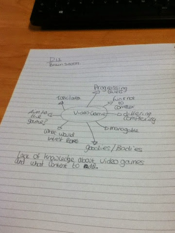
I came up with three original idea's in which I was going to later decide which one to use, I planned out all of my idea's so I could see all of them and this then helped me to decide on my final idea. I had thought about doing a video game however decided that I didn't really have much of an idea as to what I would do it about, or even how to put it together. I haven't really had much experience in creating a Video game or a DVD however thought if I choose something that I have a real passion about then I will be able to put more into it. If I did a video game based on Arsenal to me it would look a lot like other games already on the market, I would like to create something from scratch not using input from things already on the market.
By planning out more than one idea helped me as I had things to fall back out.

After looking at them for a while I had developed a few ideas and even began to investigate how it looked and possible colour schemes I could have.
My first three ideas where to do a movie based on photoshop as it was something that we are all learning about it and I thought it would/could be useful to have for later.
I also thought about a video game however didn't go into too much depth as I didn't really know much about it.
My final idea was to do something about something close to my heart and that I know a bit about therefore I chose Arsenal football club.

After a while of thinking I decided to go with the Arsenal idea as I know more about this than I do photoshop and it's something I have an interest in and can talk about more. 


Thursday 5 February 2015

Blog one - Introduction to Photoshop

On Thursday the 5th of February we had a lesson in developing skills using photo shop. During this lesson I was able to develop my skills and learn new areas which I was unaware of before. To further this I will do some reading at home to enable to develop them further.